Saturday, June 9, 2012
Bridge Work
...And I'm back! After a brief hiatus of visiting friends and family I will again be posting weekly. Did you miss me?
This painting was created for a group exhibition in New York. It is titled "Bridgework." The theme of the show was "Bridges." I enjoy wordplay, and the examination of words with multiple meanings, so when I was given the theme I wanted to look at bridges from an unexpected point of view.
My initial thoughts turned to bridge the card game. I have never played bridge, and am unfamiliar with how it works. There have also been many images created around card playing, gambling, etc., so I decided against this.
I then thought about bridges in terms of dental work. This also made me think about how many people have anxiety about going to the dentist. This lead me to think that by creating an image related to dentistry the viewer and the work would create a bridge addressing this issue. This provided another layer of meaning for bridge, and I knew that this was the definition I wanted to work with.
I then began researching the procedures for bridge work. I examined all kinds of illustrations including these:
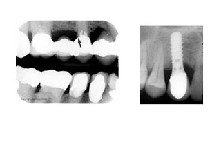
I also looked at actual x-ray images like these:
I determined that while these images are interesting (and somewhat disturbing), they may not be recognizable to viewers. I believed that I would need to create an image that could be interpreted with an element of familiarity. Most people have been to the dentist at some point, and the most common images that come to my mind when thinking about the dentist are the dental chair, the overhead light, and the dental x-ray machine. I then decided to incorporate all these images into the painting.
Getting back to the issue of dental anxiety I decided to fall back on some of the basic elements and principles of art and design. Compositions with strong diagonals have a disharmonious psychological impact on viewers, and are associated with action, fear, etc. I therefore included many diagonals from multiple angles.
Next I put some thought into the palette. Yellow is a color associated with fear ("what are you are you yella?") so I wanted to use a strong yellow base. In addition to the floor of the dentists office and the lead x-ray vest, the rest of the image relies on a strong yellow undercoat. To contrast this I also used violet, the complement to yellow, to push against the yellow and add to the visual tensions.
I think this image successfully communicates all of the ideas I was working with. It was fun to explore all of these issues, and now it will be interesting to see how viewers respond. What is your response?
Subscribe to:
Post Comments (Atom)


1 comment:
I dig it. The face of the man in the chair is very disturbing. He conjures up not only fear but violence as well, to me anyway. I felt the same emotional reaction to it that I had when I saw Francis Bacon's "Head Surrounded by Sides of Beef" for the first time.
Well done sir. You have freaked me out substantially.
Post a Comment